
i hope so. that's a yobokitteh fail there.
and so: on to the rest of the tutorial!
[part 1] [part 2] [part3]
finally~! on to the ACTUAL photographing!
right?
let's go over our list, and make sure we're ready to start our trials.
camera?
-with normal, macro, and light settings?
tripod?
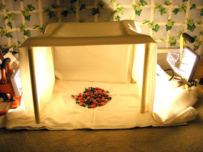
lightbox, or daylight with a sheet over the window?
background?
props (if any)?
ITEM(S)?
got all those?
ok, then, time to set up the space!
what you want in an ideal photo-taking space is:
if you want natural light:
windows! at least 1, and actually, facing north with little or no shade hitting it would be best (i'll tell you why in a second.).
a flat, CLEAN place to put your setup and item. a cluttered, uneven table does not a photo-station make.
room to stand behind your camera and not cast overt shadows.
if you have a lightbox:
a flat, clean space to set up. again, cluttered, uneven tabulature =/= photostation.
room to stand behind the camera w/o overt shadowings.
here's why the north-facing window:
the sun rises in the east, sets in the west. if the window faces north, it will get wonderful light, but not direct light. to take product shots, you want diffuse light, which means you don't want direct sunlight. even with the north-facing window, you may still need to diffuse the light further with a thin white sheet. sheer drapery will work as well, if you have sheers hanging anyway. to figure out if you need to hang that sheet, set yourself up under the window, and take a couple test shots. if they're too bright, hang the sheet.
for people taking pix in natural light, you'll want a table under said N/F window. for those of us with lightboxes, a clear space on the floor will work well. it's what i use, and haven't had issue yet (except with my kittens wanting in on the photography-actions).
 about the shadow-castings:
photographer-shadow is a sad, sad thing, and sometimes, it is unavoidable.
however! there are many many MANY ways to minimize them.
f'r'instance:
turn off the lights in the room, except those you're using with the lightbox.
close the drapes on the other windows.
 if you're still casting overt shadows, see if your camera has a timer.
if it does, set up the camera on the tripod, turn on the timer, and focus the shot.
press the shutter button, and back up 3 steps.
backing up means that you won't cast a shadow, and the timer will take the focused photo you set.
hawt, ne?
if you're CAMERA is still casting shadows that you don't like:
set the camera a little farther away, and if you need to, extend the legs of the tripod a little.
if you can't really move the tripod, position the piece a little farther away from the camera.
don't forget that you can always zoom in. ^.^
SO
FINALLY
you have everything set up!
you have everything ready!
you snap a few pictures, and when you get them onto the computer: they're blurry, or too dark, or they're yellow or blue or green or chartreuse!
this is where having patience and alterable light settings on the camera will help you.
for blurry:
tripods are your friend!
if you were USING one, try setting the timer, that way, you aren't touching the camera when the shutter closes.
also, check the focus, and make sure it's not asking you for the macro mode. sometimes, if don't use the macro when you need it, the camera will focus on something farther away.
for too dark:
if you've got that sheet over the window, move it down a little, to let some light in above it.
if you're using a light box, you need stronger lights, or a thinner top sheet. try the thinner sheet first, it's cheaper!
for the oddly-colored:
this is where the trial and error method really will save you.
you're ideally wanting to do as LITTLE post-processing as physically possible. as in, you want to crop/resize and move on.
so, try out those different light settings.
my camera has:
auto, custom, fine, shade, 3 flourescents, and an incandescent.
my absolute favourite one is the custom setting, and here's why:
you point the camera at your object, with the whole setup in place of course, and take a 'picture' of it. the camera then analyzes the picture, and comes up with a light profile based on that picture, and until you reset it, will use that profile on all the subsequent pictures.
my fuji is usually right on with the colors, though sometimes a little dark. i'd rather have a slightly darker photo than i wanted than one that's got an orange or yellow or green caste.
for 1 thing, dark is a helluvalot easier to fix than chartreuse!
aaaaaaaaaaaaaaaaand that's all kitteh has written for a tutorial.
if you have questions, please ask them! also, if there's something she didn't cover, tell us! :D
and so: on to the rest of the tutorial!
[part 1] [part 2] [part3]
finally~! on to the ACTUAL photographing!
right?
let's go over our list, and make sure we're ready to start our trials.
camera?
-with normal, macro, and light settings?
tripod?
lightbox, or daylight with a sheet over the window?
background?
props (if any)?
ITEM(S)?
got all those?
ok, then, time to set up the space!
what you want in an ideal photo-taking space is:
if you want natural light:
windows! at least 1, and actually, facing north with little or no shade hitting it would be best (i'll tell you why in a second.).
a flat, CLEAN place to put your setup and item. a cluttered, uneven table does not a photo-station make.
room to stand behind your camera and not cast overt shadows.
if you have a lightbox:
a flat, clean space to set up. again, cluttered, uneven tabulature =/= photostation.
room to stand behind the camera w/o overt shadowings.
here's why the north-facing window:
the sun rises in the east, sets in the west. if the window faces north, it will get wonderful light, but not direct light. to take product shots, you want diffuse light, which means you don't want direct sunlight. even with the north-facing window, you may still need to diffuse the light further with a thin white sheet. sheer drapery will work as well, if you have sheers hanging anyway. to figure out if you need to hang that sheet, set yourself up under the window, and take a couple test shots. if they're too bright, hang the sheet.
for people taking pix in natural light, you'll want a table under said N/F window. for those of us with lightboxes, a clear space on the floor will work well. it's what i use, and haven't had issue yet (except with my kittens wanting in on the photography-actions).
 about the shadow-castings:
photographer-shadow is a sad, sad thing, and sometimes, it is unavoidable.
however! there are many many MANY ways to minimize them.
f'r'instance:
turn off the lights in the room, except those you're using with the lightbox.
close the drapes on the other windows.
 if you're still casting overt shadows, see if your camera has a timer.
if it does, set up the camera on the tripod, turn on the timer, and focus the shot.
press the shutter button, and back up 3 steps.
backing up means that you won't cast a shadow, and the timer will take the focused photo you set.
hawt, ne?
if you're CAMERA is still casting shadows that you don't like:
set the camera a little farther away, and if you need to, extend the legs of the tripod a little.
if you can't really move the tripod, position the piece a little farther away from the camera.
don't forget that you can always zoom in. ^.^
SO
FINALLY
you have everything set up!
you have everything ready!
you snap a few pictures, and when you get them onto the computer: they're blurry, or too dark, or they're yellow or blue or green or chartreuse!
this is where having patience and alterable light settings on the camera will help you.
for blurry:
tripods are your friend!
if you were USING one, try setting the timer, that way, you aren't touching the camera when the shutter closes.
also, check the focus, and make sure it's not asking you for the macro mode. sometimes, if don't use the macro when you need it, the camera will focus on something farther away.
for too dark:
if you've got that sheet over the window, move it down a little, to let some light in above it.
if you're using a light box, you need stronger lights, or a thinner top sheet. try the thinner sheet first, it's cheaper!
for the oddly-colored:
this is where the trial and error method really will save you.
you're ideally wanting to do as LITTLE post-processing as physically possible. as in, you want to crop/resize and move on.
so, try out those different light settings.
my camera has:
auto, custom, fine, shade, 3 flourescents, and an incandescent.
my absolute favourite one is the custom setting, and here's why:
you point the camera at your object, with the whole setup in place of course, and take a 'picture' of it. the camera then analyzes the picture, and comes up with a light profile based on that picture, and until you reset it, will use that profile on all the subsequent pictures.
my fuji is usually right on with the colors, though sometimes a little dark. i'd rather have a slightly darker photo than i wanted than one that's got an orange or yellow or green caste.
for 1 thing, dark is a helluvalot easier to fix than chartreuse!
aaaaaaaaaaaaaaaaand that's all kitteh has written for a tutorial.
if you have questions, please ask them! also, if there's something she didn't cover, tell us! :D


![[link to color wheel]](http://www.psdgraphics.com/file/light-color-spectrum.jpg)